Colors enhance our lives. They add liveliness, warmth, and resplendence. The right color for home interior can dramatically amp the appeal of your house. The hues that you incorporate in your home reflect the aura of your home and help amplify the ambiance. A color palette can either make your space or break it. Colors greatly influence our mood and psyche.
They are responsible for evoking various emotions within us. The influence of each color must be regarded when choosing a color for your home. Each color has its strengths and weaknesses. It is up to us to bring out the best of each color when incorporating them into our homes. That’s the reason why choosing the right color for your home can be a bit challenging for you.
Worry not, here’s the ultimate guide to choosing the perfect color for your home out of the variety of hues along with their deeper meanings and impacts. Make sure you go through it and choose the best-suited color for your space.
Red
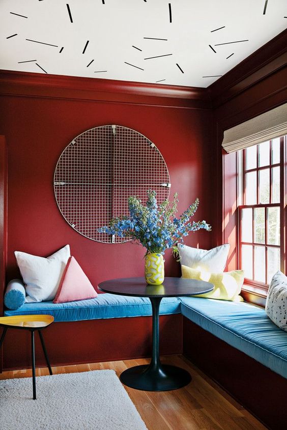
Image source: Pinterest
Hues of red symbolise passion, love, and determination. It exudes a fierce ambiance and warmth. Red is surely an attention-catcher. It is an ideal option for your living space. You can experiment with different hues of red such as wine red, Indian red, pastel red, and so on. It is going to get you tons of compliments.
Yellow
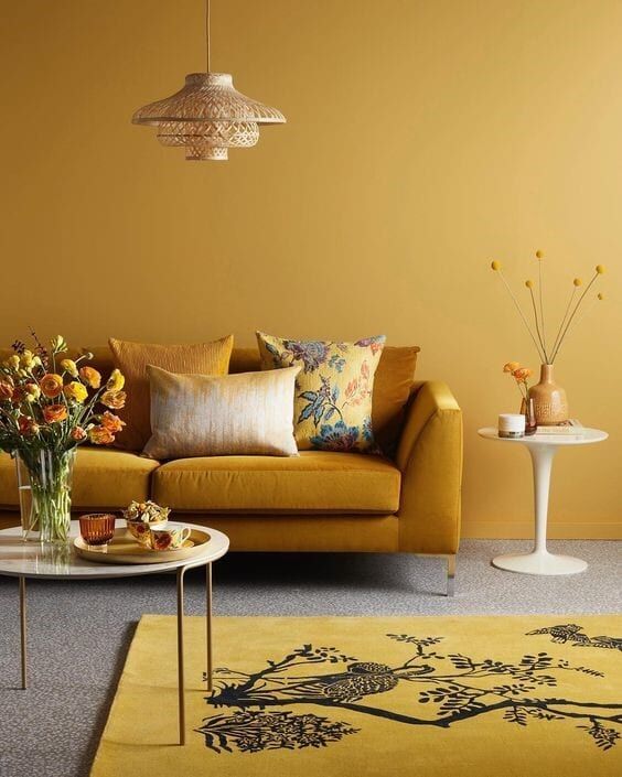
Image source: Pinterest
If you want a burst of positivity, there is no better choice than yellow. It symbolizes positivity, sunlight, and happiness. Yellow surges you with cheerfulness. It exudes warmth and boosts productivity. It can be used anywhere in the house. Study rooms can be painted yellow to boost productivity.
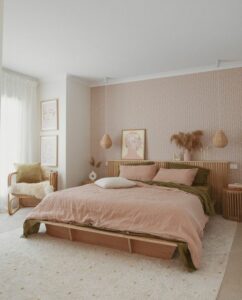
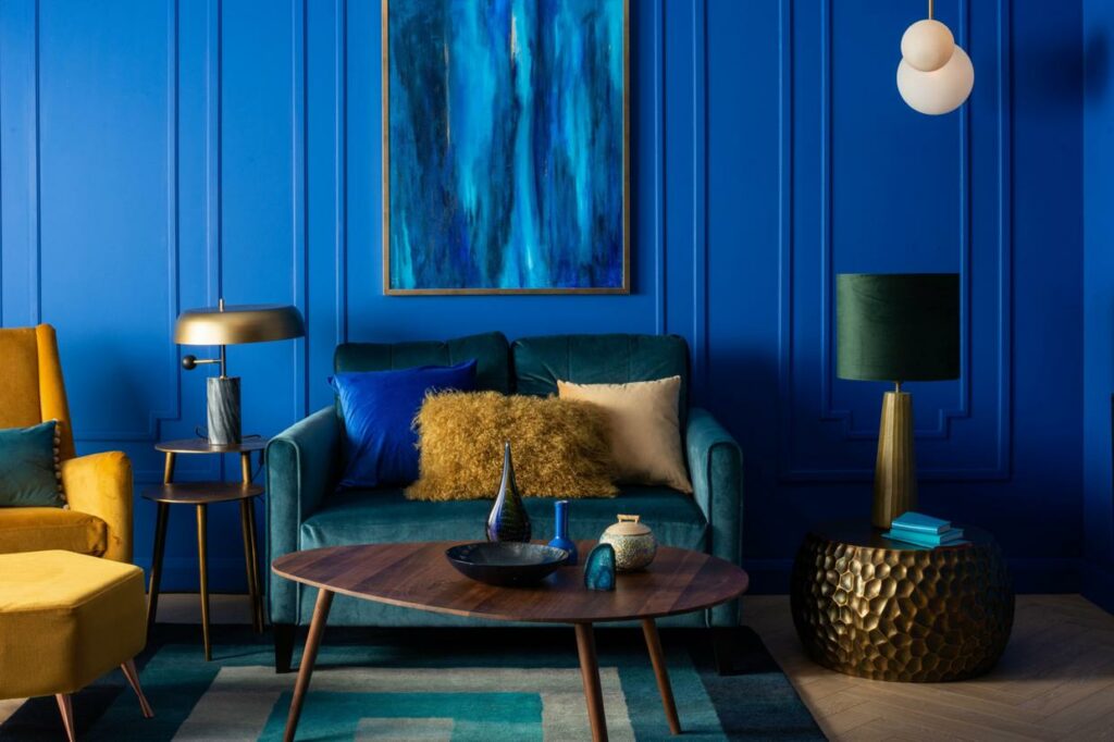
Blue
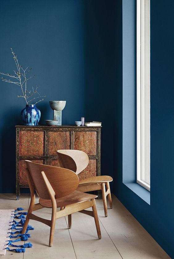
Image source: Pinterest
No other color screams tranquility and calm the way blue does. Blue is serene. And, calm like water. It is great for bathrooms and bedrooms. It makes you feel calm and helps you unwind. Do not hesitate to experiment with hues of blue to create an optical illusion and make your space look vaster than it is. Blue can be chosen for boys’ bedrooms. Hues of blue such as sky blue, midnight blue, and Prussian blue are some of the most versatile shades.
Green
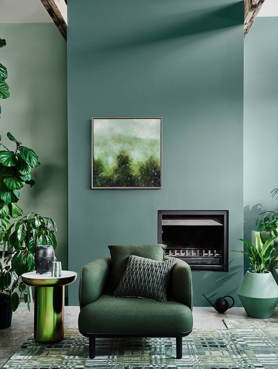
Image source: Pinterest
Incorporating hues of green in your home adds a verve of freshness to your space. It soothes your soul and is extremely therapeutic. You can infuse green in your living space and see how it helps you breathe a little slowly.
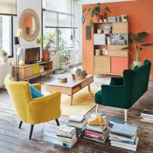
Orange
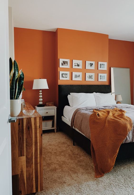
Image source: Pinterest
Orange symbolizes youthfulness and abundance. It is an eye-catcher and works well when infused with other colors and color-blocked. Orange should be used in kids’ bedrooms to create a fun and quirky space.
Purple/Lavender
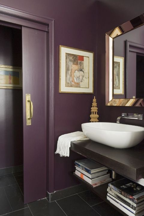
Image source: Pinterest
Purple exudes regality and royalty. It is not a commonly used color. But you should consider involving this color in your color palette. Who does not like tints and tones of royalty and luxury in their space?
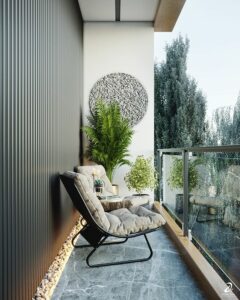
Black and White
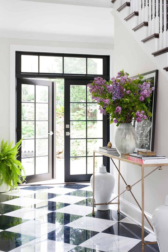
Image source: Pinterest
White emanates purity and grace. Whereas, black demands to be seen. It exudes power and dominance. You can infuse this popular combination together and make art out of your space. White can be suffused with other colors and you can boldly experiment with textures and patterns to enhance your space and make it appear more artistic. A back and white room look majestic. Yes, color is important but so is furniture.
Like in the picture given below you can have a black and white themed balcony. Here the tiles and cushion covers are black and white in different patterns. To break the monotony there are plants and wooden chairs and cane lanterns.
Additional Tips
- For a zen effect: To create a zen effect, go for subtle colors blue, pink, yellow, white, and so on. Light colors reflect sunlight abundantly and fill the room with a surge of positivity. They impart restfulness. You can complement your home furnishings with these colors.
- For a graceful look: Neutral colors look very cosmopolitan. They are simple yet sophisticated. You can add earthy shades to achieve tranquility and peacefulness. They make your space appear spacious.
- For a resplendent look: You can use vibrant colors to bring out that ‘oomph’ factor. Color blocking works fine when you want to experiment with bold colors. Color blocking adds a pop of color to your space and turns an otherwise boring room into a visual delight.
We hope you infuse these tips and tricks in your home and make it stand out!